Social-Platform
Social-Platform
Social-Platform
Using design gaps to create foundational structure that guides & develops Beta-product readiness.
Using design gaps to create foundational structure that guides & develops Beta-product readiness.
Using design gaps to create foundational structure that guides & develops Beta-product readiness.
*Due to client NDA terms, the logo has been changed and company name has been excluded. Also, certain areas of text copy has been replaced with descriptive text instead of site verbatim.
*Due to client NDA terms, the logo has been changed and company name has been excluded. Also, certain areas of text copy has been replaced with descriptive text instead of site verbatim.
Question gathering user data for site development. *NDA prevents showing actual content*
Question gathering user data for site development. *NDA prevents showing actual content*
Question gathering user data for site development. *NDA prevents showing actual content*
*Due to client NDA terms, the logo has been changed and company name has been excluded. Also, certain areas of text copy has been replaced with descriptive text instead of site verbatim.
Goal-tracking flows tied to badge rewards that strengthen user engagement.
Users can add the number of goals as desired by clicking the underscored “+ Add Goals” text.
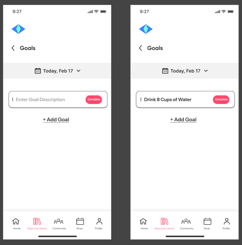
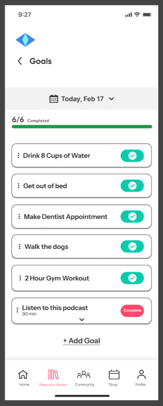
Each field is given a toggle switch button so users can indicate to the site admins that the goal has been completed.
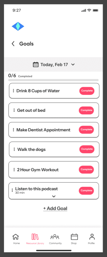
Prototyped action is revealed once the user marks the 6th goal as complete.
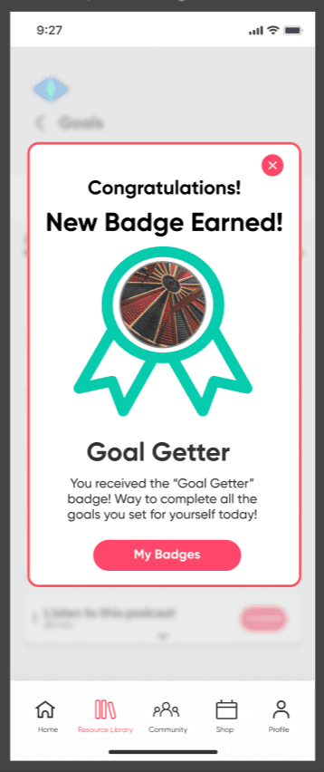
User achieves the “Goal Getter” badge for completing all the goals they have set for themselves for the day and promotes further user engagement with setting goals and attaining different badges.
Course-based learning that reinforce the platform’s mission.
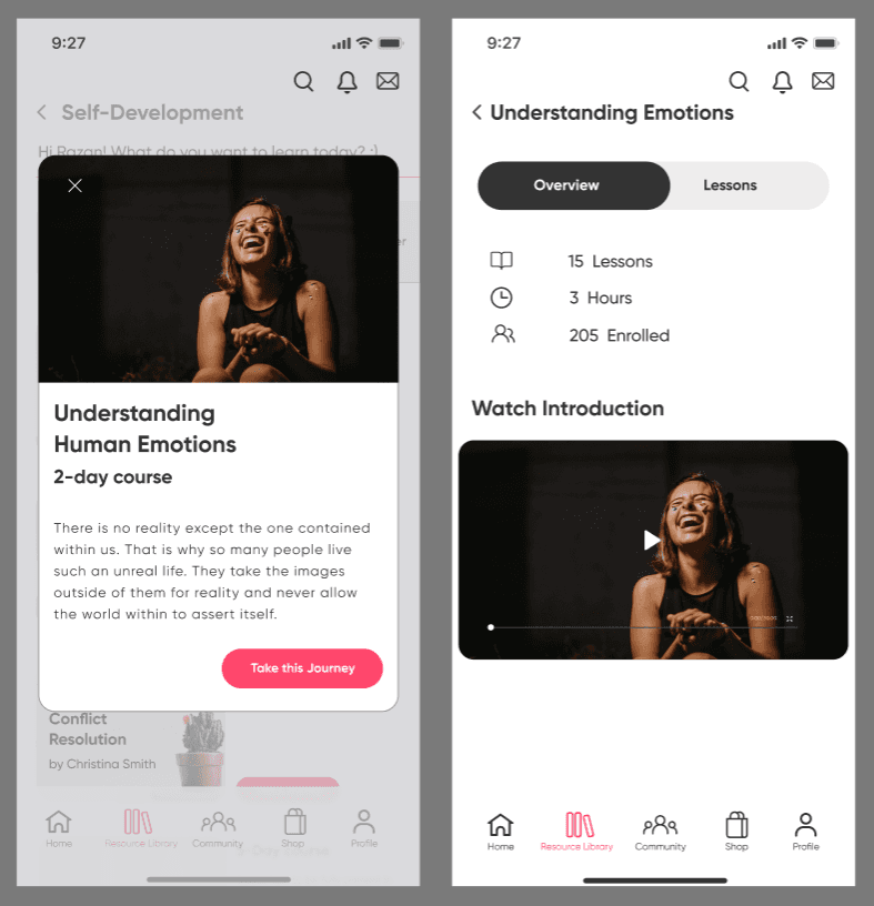
Original content showed disjointed navigation to the course enrollment CTA using multiple screens.
Original Screens
Update
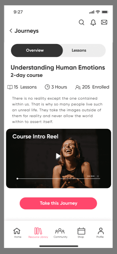
By consolidating course info & CTA onto 1 screen, the updated version presents a clearer path through the course details that lead users to the course CTA.
Original Screen
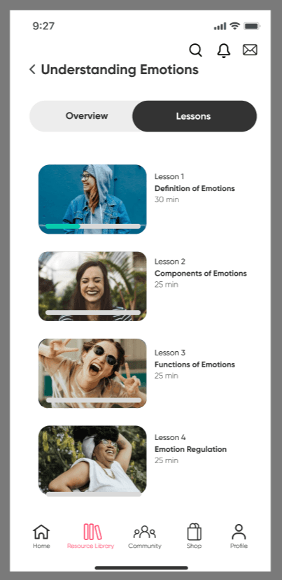
Lacked opportunity for users to indicate to back end development that a video lesson has been completed.
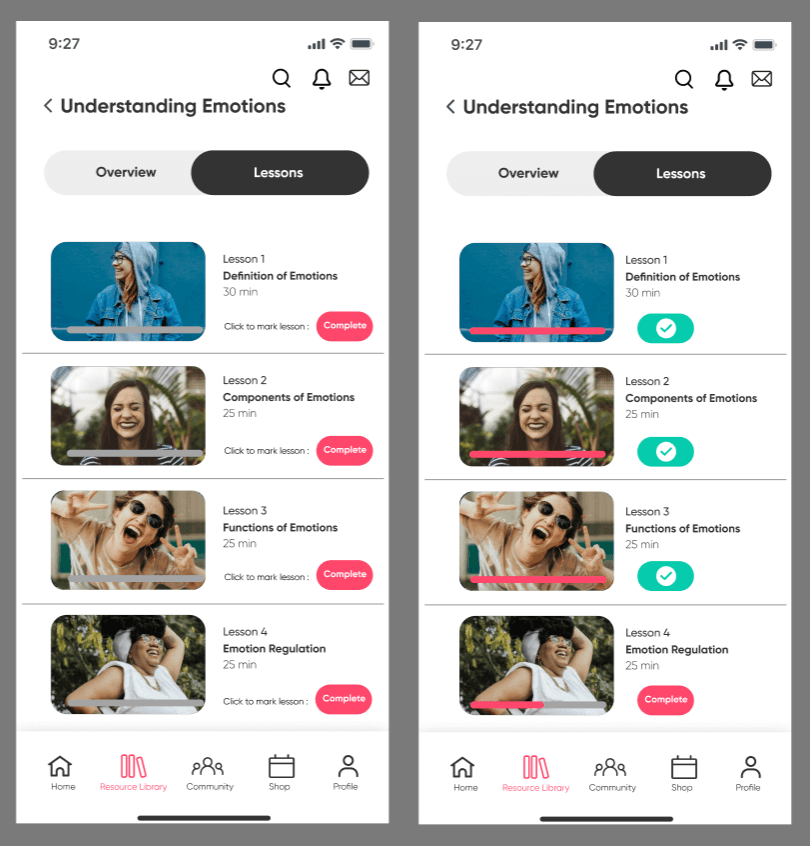
Added toggle switch buttons for users to indicate the video lesson has been completed.
Once all videos have been marked as complete, this will indicate to admins that the user has completed the course.
Updated Version
User Flow for blog contributor forms.
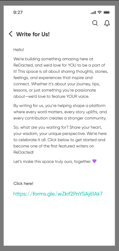
Overwhelms users with copy text, especially having the bloggers form linked to a full http address instead of using a CTA button.
Original Screen
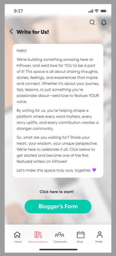
Screen copy was framed with rounded corners. padding & a white fill so users can read text against the blurred background image, giving more life to the screen.
Updated Screen
Form fields were created for users who routinely engage in blogging content and have an interest in writing blogs for the platform.
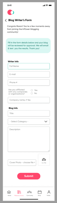
Version 1
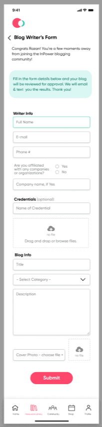
Client feedback: Requested fields created for users to upload credentials as an option.
Final
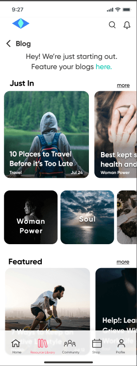
Original blog content integrated with IRB touchpoints.
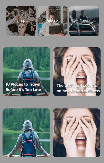
Original Blog Tiles
Content had limited representation and contained repeat imagery.
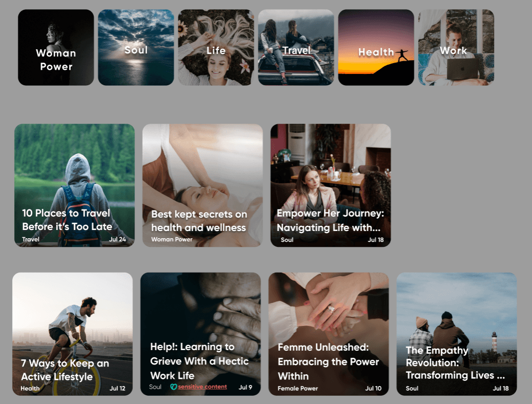
Blog topic tiles with new images to represent all of the content in the Blog section
Updated Blog Tiles
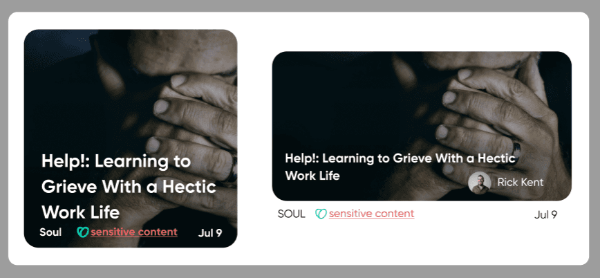
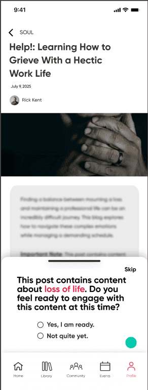
Warning labels were added for blogs containing possibly triggering content.
Sensitive Topic Blog Tile
Sensitive Topic Blog with IRB
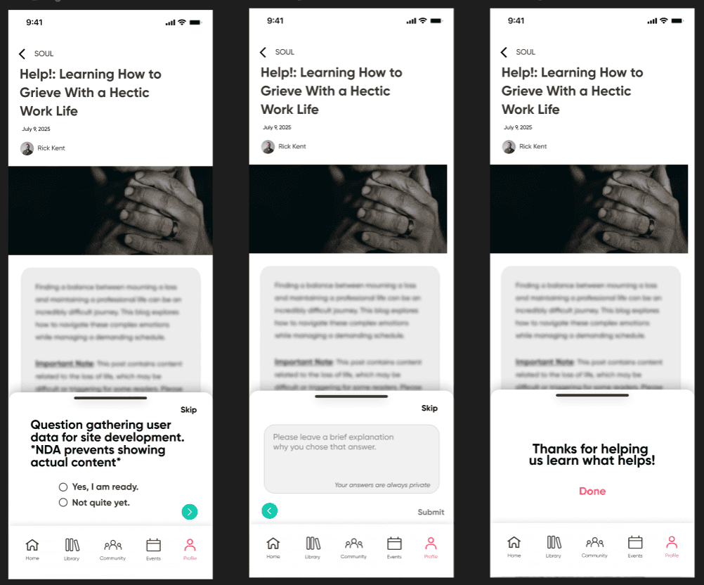
IRB pops up like a drawer that users can swipe down to exit from.
Users have the option to skip or give further details
Content is blurred out with text only made visible if users indicate they're ready to engage with the content.
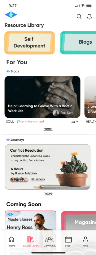
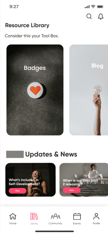
New Resource Library Lading Screens.
Originally, the Resource Library had limited content for user interaction & needed more content to provide foundational structure to the section.
Original Screen
Client expressed that the landing screen felt “a little too busy on the eyes” with all of the tiles, and that the imagery used still felt “too dark”.
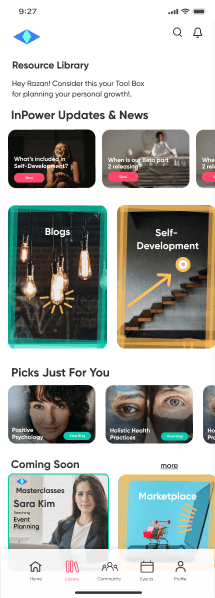
Version 1
Versions 2 & 3: Show the imagery used for the library sections were unnecessary & added to overwhelming the eyes. They were removed, but the marker coloring style borders were kept to maintain the more playful feel the client wanted.
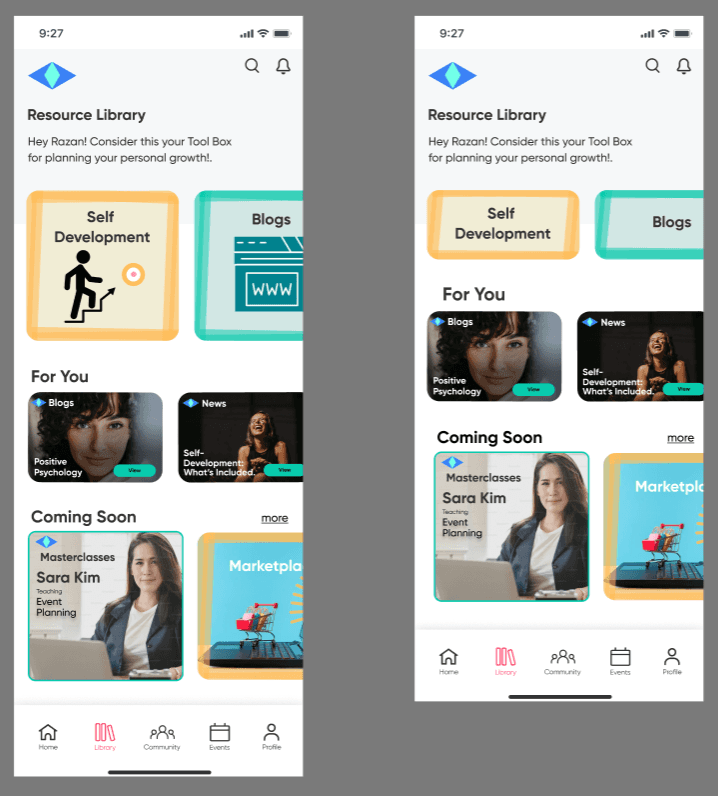
Resource Library Drafts 2 & 3
The final version expands user scope of interaction with content within the Resource Library by:
“Coming Soon” section that highlights upcoming platform content.
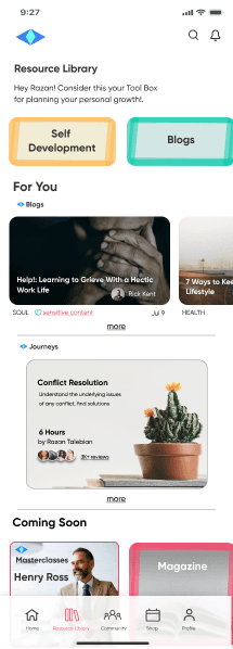
Learning courses offered within the "Self Development" subsection of the library.
Final
Adding a horizontal scroll menu of featured blogs catered to the user
Process
Process
Process
Outcome & Impact
Outcome & Impact
Outcome & Impact
Through iterative prototyping and collaborative client feedback cycles, we transformed a fragmented beta into a cohesive, launch-ready ecosystem. The final solution:
Through iterative prototyping and collaborative client feedback cycles, we transformed a fragmented beta into a cohesive, launch-ready ecosystem. The final solution:
Through iterative prototyping and collaborative client feedback cycles, we transformed a fragmented beta into a cohesive, launch-ready ecosystem. The final solution:
Closed critical content gaps
Improved structural clarity and navigation
Strengthened the system’s infrastructure
Positioned the platform for long-term engagement that ensured a growing future user base
Closed critical content gaps
Improved structural clarity and navigation
Strengthened the system’s infrastructure
Positioned the platform for long-term engagement that ensured a growing future user base
Closed critical content gaps
Improved structural clarity and navigation
Strengthened the system’s infrastructure
Positioned the platform for long-term engagement that ensured a growing future user base
Full Resource Library Prototype
Resource Library Prototype
Full Resource Library Prototype
What I Learned
What I Learned
What I Learned
How to work within a design team.
How to work within a design team.
How to work within a design team.
Creating effective designs based on client feedback.
Creating effective designs based on client feedback.
Creating effective designs based on client feedback.
Honoring NDA requirements within design breakdowns.
Honoring NDA requirements within design breakdowns.
Honoring NDA requirements within design breakdowns.
Areas To Improve
Areas To Improve
Areas To Improve
Communitive Collaboration with other team members to more efficiently ideate & iterate designs
Communitive Collaboration with other team members to more efficiently ideate & iterate designs
Communitive Collaboration with other team members to more efficiently ideate & iterate designs
Initiating more descriptive client feedback that can better help guide design decisions.
Initiating more descriptive client feedback that can better help guide design decisions.
Initiating more descriptive client feedback that can better help guide design decisions.
I partnered with two other product designers to support a client preparing for beta launch. Our team was tasked with identifying design gaps that affected site navigation and alignment with the platform’s mission for its users. In addition to improving the front-end user experience, we were also assigned to:
I partnered with two other product designers to support a client preparing for beta launch. Our team was tasked with identifying design gaps that affected site navigation and alignment with the platform’s mission for its users. In addition to improving the front-end user experience, we were also assigned to:
Figma, Figjam, Riipen, Zoom
Tools:
UX research, user interviews, prototyping, usability testing
UX/UI designer, Prototype test moderator
Job duties:
Role:
Redraft original content that can structurally stabilize the and direct the type of content needed to round out the Resource Library prototype
Redraft original content that can structurally stabilize the and direct the type of content needed to round out the Resource Library prototype
Design a system of intuitive IRB checkpoints embedded within the user experience.
Create new content to help complete the platform's Resource Library to increase areas for user engagement in the beta prototype.
Create new content to help complete the platform's Resource Library to increase areas for user engagement in the beta prototype.
Design a system of intuitive IRB checkpoints embedded within the user experience.
Case Context
Case Context
Figma, Figjam
Figma, Figjam
Tools:
Tools:
Product design, prototyping, usability test moderator
Product design, prototyping, usability test moderator
UX/UI Designer
UX/UI Designer
Job duties:
Job duties:
Role:
Role:
Timeline: 5 Weeks
The Problem
The Problem
During our heuristic evaluation we identified: Lack of Content, Structure & User Engagement.
During our heuristic evaluation we identified: Lack of Content, Structure & User Engagement.
Lack of content across key platform areas platform that highly limited user interaction.
Lack of content across key platform areas platform that highly limited user interaction.
Inconsistent information hierarchy & fragmented UI patterns
Inconsistent information hierarchy & fragmented UI patterns
Structural gaps within the Resource Library, repeat imagery & structurally lacked foundational organization & scalability
Structural gaps within the Resource Library, repeat imagery & structurally lacked foundational organization & scalability
Addressing both content and structural deficiencies at this critical pre-launch stage was essential to ensuring a cohesive beta experience that demonstrates how users can engage with the platform.
Addressing both content and structural deficiencies at this critical pre-launch stage was essential to ensuring a cohesive beta experience that demonstrates how users can engage with the platform.
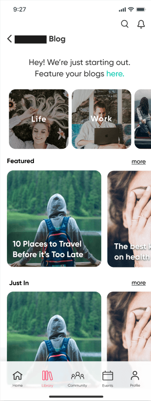
Original Screens
Original Screens
As a team, we conducted a comprehensive platform content audit to uncover design gaps and navigation breakdowns. This allowed us to synthesize user-centered insights to improve clarity and mission alignment across the system.
We were also tasked to develop a framework for embedding IRB checkpoints into natural user interactions, allowing the platform to gather meaningful feedback without disrupting user flow.
I took ownership of restructuring and defining the Resource Library user experience. Redrafting original designs and creating new content was needed to provide more opportunity to showcase user interaction points for the beta prototype.
I took ownership of restructuring and defining the Resource Library user experience. Redrafting original designs and creating new content was needed to provide more opportunity to showcase user interaction points for the beta prototype.
I took ownership of restructuring and defining the Resource Library user experience. Redrafting original designs and creating new content was needed to provide more opportunity to showcase user interaction points for the beta prototype.
The Team Strategy
The Team Strategy
The Team Strategy
Delegation & Design Execution
Delegation & Design Execution
Delegation & Design Execution
As a team, we conducted a comprehensive platform content audit to uncover design gaps and navigation breakdowns. This allowed us to synthesize user-centered insights to improve clarity and mission alignment across the system.
We were also tasked to develop a framework for embedding IRB checkpoints into natural user interactions, allowing the platform to gather meaningful feedback without disrupting user flow.
As a team, we conducted a comprehensive platform content audit to uncover design gaps and navigation breakdowns. This allowed us to synthesize user-centered insights to improve clarity and mission alignment across the system.
We were also tasked to develop a framework for embedding IRB checkpoints into natural user interactions, allowing the platform to gather meaningful feedback without disrupting user flow.
New Resource Library landing screens.
New Resource Library landing screens.
Originally, the Resource Library had limited content for user interaction & needed more content to provide foundational structure to the section.
Originally, the Resource Library had limited content for user interaction & needed more content to provide foundational structure to the section.
Original Screen
Original Screen
Client expressed that the landing screen felt “a little too busy on the eyes” with all of the tiles, and that the imagery used still felt “too dark”.
Client expressed that the landing screen felt “a little too busy on the eyes” with all of the tiles, and that the imagery used still felt “too dark”.
Version 1
Version 1
Versions 2 & 3: Show the imagery used for the library sections were unnecessary & added to overwhelming the eyes. They were removed, but the marker coloring style borders were kept to maintain the more playful feel the client wanted.
Versions 2 & 3: Show the imagery used for the library sections were unnecessary & added to overwhelming the eyes. They were removed, but the marker coloring style borders were kept to maintain the more playful feel the client wanted.
Resource Library Drafts 2 & 3
Resource Library Drafts 2 & 3
Expands user scope of interaction with content within the Resource Library by:
Expands user scope of interaction with content within the Resource Library by:
“Coming Soon” section that highlights upcoming platform content.
“Coming Soon” section that highlights upcoming platform content.
Learning courses offered within the "Self Development" subsection of the library.
Learning courses offered within the "Self Development" subsection of the library.
Adding a horizontal scroll menu of featured blogs catered to the user
Adding a horizontal scroll menu of featured blogs catered to the user
Final Version
Final Version
Original blog content integrated with IRB touchpoints.
Original blog content integrated with IRB touchpoints.
Content had limited representation and contained repeat imagery.
Content had limited representation and contained repeat imagery.
Original Blog Tiles
Original Blog Tiles
Blog topic tiles with new images to represent all of the content in the Blog section
Blog topic tiles with new images to represent all of the content in the Blog section
Updated Blog Tiles
Updated Blog Tiles
Warning labels were added for blogs containing possibly triggering content.
Warning labels were added for blogs containing possibly triggering content.
Sensitive Topic Blog Tile
Sensitive Topic Blog Tile
IRB pops up like a drawer that users can swipe down to exit from.
IRB pops up like a drawer that users can swipe down to exit from.
Users have the option to skip or give further details
Users have the option to skip or give further details
Content is blurred out with text only made visible if users indicate they're ready to engage with the content.
Content is blurred out with text only made visible if users indicate they're ready to engage with the content.
Sensitive Topic Blog with IRB
Sensitive Topic Blog with IRB
User Flow for blog contributor forms.
User Flow for blog contributor forms.
Overwhelms users with copy text, especially having the bloggers form linked to a full http address instead of using a CTA button.
Overwhelms users with copy text, especially having the bloggers form linked to a full http address instead of using a CTA button.
Original Screen
Original Screen
Screen copy was framed with rounded corners. padding & a white fill so users can read text against the blurred background image, giving more life to the screen.
Screen copy was framed with rounded corners. padding & a white fill so users can read text against the blurred background image, giving more life to the screen.
Updated Screen
Updated Screen
Form fields were created for users who routinely engage in blogging content and have an interest in writing blogs for the platform.
Form fields were created for users who routinely engage in blogging content and have an interest in writing blogs for the platform.
Version 1
Version 1
Client feedback: Requested fields created for users to upload credentials as an option.
Client feedback: Requested fields created for users to upload credentials as an option.
Final
Final
Content for the Self-Development landing screen & section
Content for the Self-Development landing screen & section
The Self-Development subsection of the Resource Library lacked content providing foundational structure for user interaction in the prototype.
The Self-Development subsection of the Resource Library lacked content providing foundational structure for user interaction in the prototype.
Laying the foundation for the horizontal menu scroll would subsequently provide structure for the entire section.
Laying the foundation for the horizontal menu scroll would subsequently provide structure for the entire section.
The client disclosed that masterclasses would later be added, so tiles were created to represent content coming soon to that section.
The client disclosed that masterclasses would later be added, so tiles were created to represent content coming soon to that section.
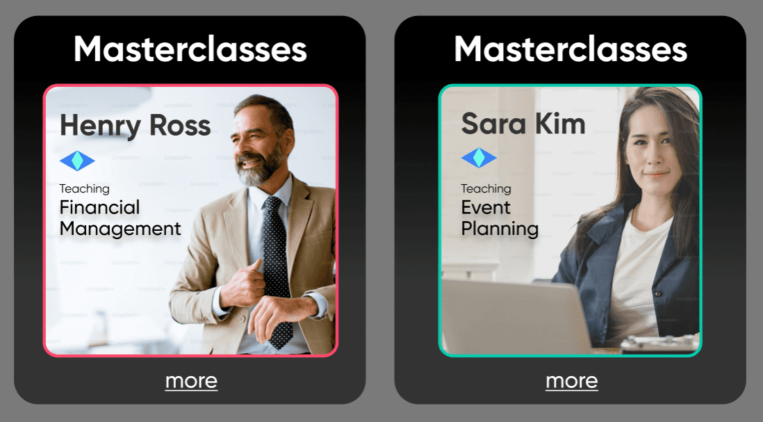
Coming Soon Content
Coming Soon Content
Images were removed from the menu scroll to resemble the menu from resource library landing screen
Images were removed from the menu scroll to resemble the menu from resource library landing screen
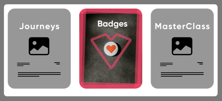
Section Carousel Version 1
Section Carousel Version 1
Interview insights revealed users expected "Self Development" included:
Interview insights revealed users expected "Self Development" included:
- goal tracking
- goal tracking
- learning courses
- learning courses

Final Version
Final Version
Version 1
Version 1
Final Version
Final
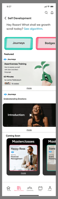
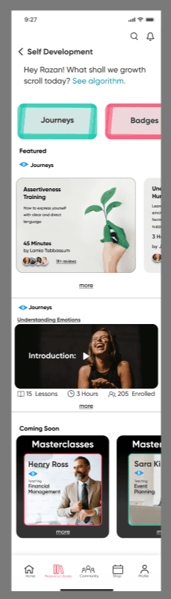
Client Feedback: Preferred the "Featured" content on the Self Development landing screen have a horizontal scroll menu to indicate multiple courses, with the remaining carousel content clipped from the frame.
Client Feedback: Preferred the "Featured" content on the Self Development landing screen have a horizontal scroll menu to indicate multiple courses, with the remaining carousel content clipped from the frame.
Course-based learning that reinforce the platform’s mission.
Course-based learning that reinforce the platform’s mission.
Original content showed disjointed navigation to the course enrollment CTA using multiple screens.
Original content showed disjointed navigation to the course enrollment CTA using multiple screens.
Original Screens
Original Screens
Update
Update
By consolidating course info & CTA onto 1 screen, the updated version presents a clearer path through the course details that lead users to the course CTA.
By consolidating course info & CTA onto 1 screen, the updated version presents a clearer path through the course details that lead users to the course CTA.
Lacked opportunity for users to indicate to back end development that a video lesson has been completed.
Lacked opportunity for users to indicate to back end development that a video lesson has been completed.
Original Screen
Original Screen
Added toggle switch buttons for users to indicate the video lesson has been completed.
Added toggle switch buttons for users to indicate the video lesson has been completed.
Once all videos have been marked as complete, this will indicate to admins that the user has completed the course.
Once all videos have been marked as complete, this will indicate to admins that the user has completed the course.
Updated Version:
Updated Version
Continuity between badge representation & platform tone
Continuity between badge representation & platform tone
Content contained inconsistent visual cues.
Content contained inconsistent visual cues.
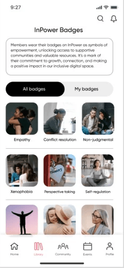
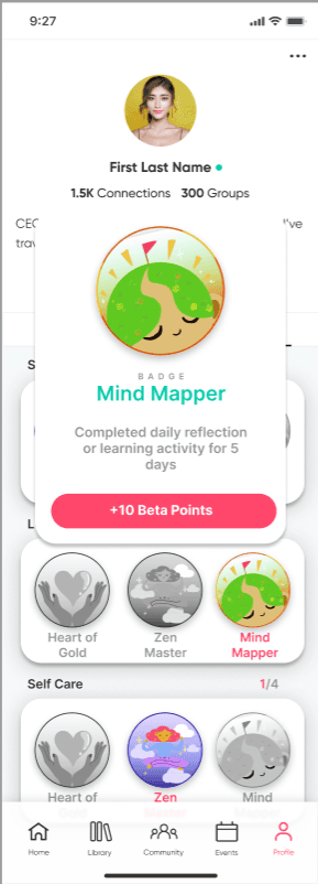
Client Feedback: Felt the 1st option was "too serious" & 2nd option was "too cartoony".
Client Feedback: Felt the 1st option was "too serious" & 2nd option was "too cartoony".
Original Screens
Original Screens
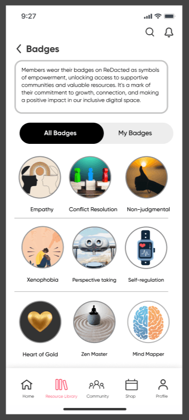
Badges changed from squares with rounded corners to a circular.
Badges changed from squares with rounded corners to a circular.
Finding new images in the middle ground allowed new badge designs to better match the platform tone.
Finding new images in the middle ground allowed new badge designs to better match the platform tone.
Before
After
Before
After
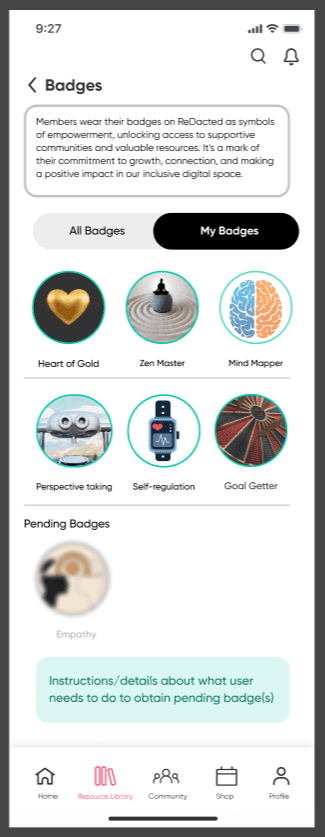
Added UI navigation for users to return to previous screen.
Added UI navigation for users to return to previous screen.
Badges earned are given a green stroke and image blur layer is removed.
Badges earned are given a green stroke and image blur layer is removed.
Pending badge images are blurred out with grey text labels.
Pending badge images are blurred out with grey text labels.
User Badges
User Badges
Goal-tracking flows tied to badge rewards that strengthen user engagement
Goal-tracking flows tied to badge rewards that strengthen user engagement
Users can add the number of goals as desired by clicking the underscored “+ Add Goals” text.
Users can add the number of goals as desired by clicking the underscored “+ Add Goals” text.
Each field is given a toggle switch button so users can indicate to the site admins that the goal has been completed.
Each field is given a toggle switch button so users can indicate to the site admins that the goal has been completed.
Prototyped action is revealed once the user marks the 6th goal as complete.
Prototyped action is revealed once the user marks the 6th goal as complete.
User achieves the “Goal Getter” badge for completing all the goals they have set for themselves for the day and promotes further user engagement with setting goals and attaining different badges.
User achieves the “Goal Getter” badge for completing all the goals they have set for themselves for the day and promotes further user engagement with setting goals and attaining different badges.
Create new content to help complete the platform's Resource Library to increase areas for user engagement in the beta prototype.
Design a system of intuitive IRB checkpoints embedded within the user experience.
Redraft original content that can structurally stabilize the and direct the type of content needed to round out the Resource Library prototype
I partnered with two other product designers to support a client preparing for beta launch. Our team was tasked with identifying design gaps that affected site navigation and alignment with the platform’s mission for its users. In addition to improving the front-end user experience, we were also assigned to:
Figma, Figjam, Riipen, Zoom
Tools:
UX research, user interviews, prototyping, usability testing
UX/UI designer, Prototype test moderator
Job duties:
Role:
Case Context
Figma, Figjam
Tools:
UX/UI Designer
Job duties:
Role:
Prototyping
Product Design
UI Design
Test Moderating
UX Research
The Problem
During our heuristic evaluation we identified: Lack of Content, Structure & User Engagement.
Lack of content across key platform areas platform that highly limited user interaction.
Inconsistent information hierarchy & fragmented UI patterns
Structural gaps within the Resource Library, repeat imagery & structurally lacked foundational organization & scalability
Addressing both content and structural deficiencies at this critical pre-launch stage was essential to ensuring a cohesive beta experience that demonstrates how users can engage with the platform.
Original Screens
Content for the Self-Development landing screen & section .
The Self-Development subsection of the Resource Library lacked content providing foundational structure for user interaction in the prototype.
Laying the foundation for the horizontal menu scroll would subsequently provide structure for the entire section.
The client disclosed that masterclasses would later be added, so tiles were created to represent content coming soon to that section.
Coming Soon Content
Images were removed from the menu scroll to resemble the menu from resource library landing screen
Section Carousel Version 1
Interview insights revealed users expected "Self Development" included:
- goal tracking
- learning courses
Final Version
Version 1
Final
Client Feedback: Preferred the "Featured" content on the Self Development landing screen have a horizontal scroll menu to indicate multiple courses, with the remaining carousel content clipped from the frame.
Continuity between badge representation & platform tone
Content contained inconsistent visual cues.
Client Feedback: Felt the 1st option was "too serious" & 2nd option was "too cartoony".
Original Screens
Badges changed from squares with rounded corners to a circular.
Finding new images in the middle ground allowed new badge designs to better match the platform tone.
Before
After
Added UI navigation for users to return to previous screen.
Badges earned are given a green stroke and image blur layer is removed.
Pending badge images are blurred out with grey text labels.
User Badges